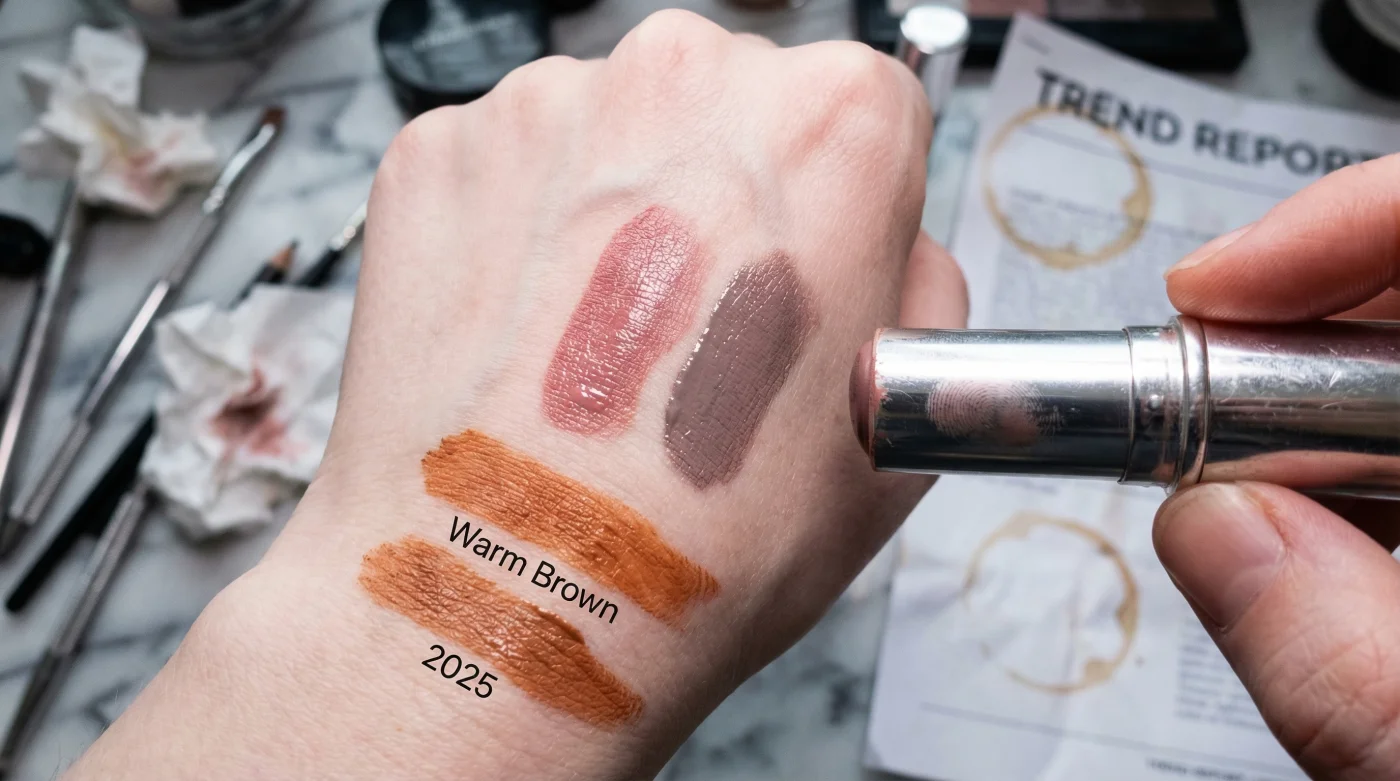
It is a phenomenon currently being observed in vanity mirrors from Vancouver to Halifax: that beloved "latte" makeup look, which dominated social feeds throughout 2024, suddenly looks jarringly synthetic. As the distinctive, blue-tinted light of a Canadian spring begins to filter through the grey, the rich terracotta and warm spice tones that once warmed up your complexion are now rendering post-winter skin sallow rather than sun-kissed. The industry is witnessing a massive pivot away from forced warmth toward a more structural, sophisticated aesthetic.
This is not merely a fleeting viral moment; it is a correction in colour theory. Leading aestheticians and colour analysts have identified a "silent shift" in the Spring "Nude" Palette for 2025. The secret lies in abandoning the orange undertones of yesterday for a specific range of desaturated, cool-leaning hues that harmonize with, rather than fight against, the cooler ambient light of March and April. Before you purge your makeup bag, however, it is critical to understand why this shift is happening and the one key adjustment required to master it.
The Science of Northern Light and Skin Undertones
To master the new Spring "Nude" Palette, one must first understand the physics of lighting in the northern hemisphere. In Canada, the solar angle in early spring creates a natural light temperature that hovers around 5000 to 6500 Kelvin—a crisp, blue-white light. Warm, orange-based browns create a high-contrast "clash" under this illumination, often making the wearer appear jaundiced or fatigued. By switching to cool-toned nudes—think greige, taupe, and dusty mauve—you align your cosmetic profile with the environment, creating a cleaner, high-status appearance known as chromatic harmony.
The following table outlines why this shift is essential for the Canadian demographic this season:
Table 1: The Warm vs. Cool Nude Impact Analysis
| Feature | The 2024 "Warm-Brown" Habit | The 2025 "Cool-Toned" Solution |
|---|---|---|
| Interaction with Pale Skin | Amplifies redness and creates a "muddy" cast on the jawline. | Neutralizes redness and mimics natural shadows for a sculpting effect. |
| Visual Effect in Daylight | Appears orange or synthetic under overcast Canadian skies. | Reads as "Cashmere Skin"—expensive, effortless, and native. |
| Primary Aesthetic Goal | To fake a tan (Sun-mimicry). | To enhance bone structure (Architectural definition). |
Understanding the theoretical necessity of this switch is the foundation, but executing it requires precise knowledge of pigment "dosing" to avoid looking washed out.
The Protocol: Precision Dosing and Shade Selection
- Your chapped lips are a “moisture leak” and this overnight slugging ritual heals them
- Your smartphone is aging you faster than the sun: why this happens
- The “Cool-Toned Nude” officially replaced the 2025 warm-brown trend
- Your “spring shedding” is a clogged pore crisis and this $2 homemade scrub stops it
- Stop the “ashy” spring leg look with the record-breaking “oil-on-wet” hack
Colour theorists suggest a specific application method for these shades. Unlike warm bronzers which are swept across the high points of the face (forehead, nose bridge), cool Spring "Nude" Palettes should be applied strictly to the hollows and perimeters to build structure. The goal is to mimic the natural shadows cast by the lower sun angle of spring.
Table 2: Pigment Dosing & Application Science
| Skin Depth | The "Hero" Cool Tone (Target Hex Logic) | Technical Dosing (Application) |
|---|---|---|
| Fair / Light | Desaturated Rose / Soft Greige Avoid: anything yellow-based. |
1.5g Powder / 2 dots Liquid Apply at a 45-degree angle from ear tragus toward the mouth corner, stopping at the iris line. |
| Medium / Olive | True Taupe / Mauve-Brown Avoid: terracotta or brick. |
2.0g Powder / 3 dots Liquid Focus on the "3" shape perimeter. Blend upwards to lift the visage. |
| Deep / Dark | Espresso / Cool Plum-Brown Avoid: red-based chocolates. |
Highly Pigmented Cream Use a dense brush to press (stipple) pigment into the hollow of the cheek. Do not drag. |
Once you have mastered the placement and shade selection, you must learn to identify the symptoms of a mismatched application to troubleshoot effectively.
Diagnostic Guide: Troubleshooting the Cool-Tone Look
Transitioning to a cool palette can be tricky after years of warm-toned dominance. If your look feels "off," consult this diagnostic checklist. In aesthetic medicine and professional artistry, identifying the chromatic error is the first step to correction.
- Symptom: The face looks dirty or bruised rather than sculpted.
- Diagnosis: The product has too much black/blue pigment (too low value).
- The Fix: Switch to a shade with a slightly higher luminosity but keep the cool undertone.
- Symptom: The skin looks flat and corpse-like.
- Diagnosis: Lack of "life" colour to balance the sculpting cool tones.
- The Fix: Introduce a cool-toned pink blush (Dusty Rose) on the apples of the cheeks. This restores blood flow simulation without reintroducing orange.
- Symptom: Texture is emphasized, and pores look larger.
- Diagnosis: Using a matte powder on dehydrated, post-winter skin.
- The Fix: Switch to a cream or gel formula. Canadian springs are often dry (humidity below 40%), requiring emollient-based products.
With the diagnostic tools in hand, the final step is ensuring your shopping list reflects high-performance criteria rather than marketing fluff.
Curating Your Arsenal: The Quality Standard
The market is flooded with "contour" products, but true cool-toned nudes are rare. When visiting your local beauty centre or pharmacy, you must scrutinize the ingredient labels and swatches. A true Spring "Nude" Palette product should blend seamlessly into the skin, mimicking the texture of real skin rather than sitting on top of it like a mask.
Below is your definitive guide to separating high-quality formulations from subpar trends.
Table 3: The Quality Matrix (Selection Guide)
| Category | What to Look For (Green Flag) | What to Avoid (Red Flag) |
|---|---|---|
| Undertone Fidelity | Shades described as "Stone," "Biscuit," "Mushroom," or "Ash." Swatches should look almost grey in the pan. | Shades described as "Golden," "Sunset," or "Bronze." Any product that turns orange upon oxidation. |
| Texture & Finish | Satin or Demi-Matte finishes. These mimic healthy skin hydration levels suitable for 5°C to 15°C weather. | Ultra-Matte powders (chalky appearance) or High-Shimmer glitters (looks artificial in spring daylight). |
| Longevity | "Build-able" formulas. You want sheer layers that integrate with your SPF. | "One-swipe opacity." Heavy pigments are difficult to blend and often result in harsh lines. |
By adhering to these architectural principles and selecting the correct cool-toned hues, you elevate your aesthetic from a dated trend to a timeless, sophisticated standard suitable for the modern Canadian landscape.
Read More